ESP
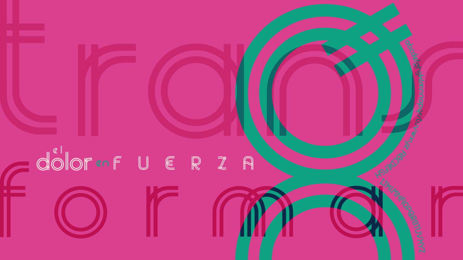
Fuente tipográfica creada como homenaje a una persona influyente y profunda en mi vida. Su existencia marcó la mía desde el nacimiento, y su partida me permitió comprender la importancia de vivir con alegría a pesar del dolor. Las formas duales de la fuente representan las dos maneras en que mi tía Azucena habitó el mundo: mostrando fuerza e inteligencia para ocultar el dolor interno y el rechazo que enfrentó por su apariencia física.
ENG
A typeface created as a tribute to a deeply influential person in my life. Her existence shaped mine from birth, and her passing led me to understand the importance of living with joy despite pain. The dual forms of the typeface represent the two ways my aunt Azucena inhabited the world: displaying strength and intelligence to conceal her inner pain and the rejection she faced because of her physical appearance.
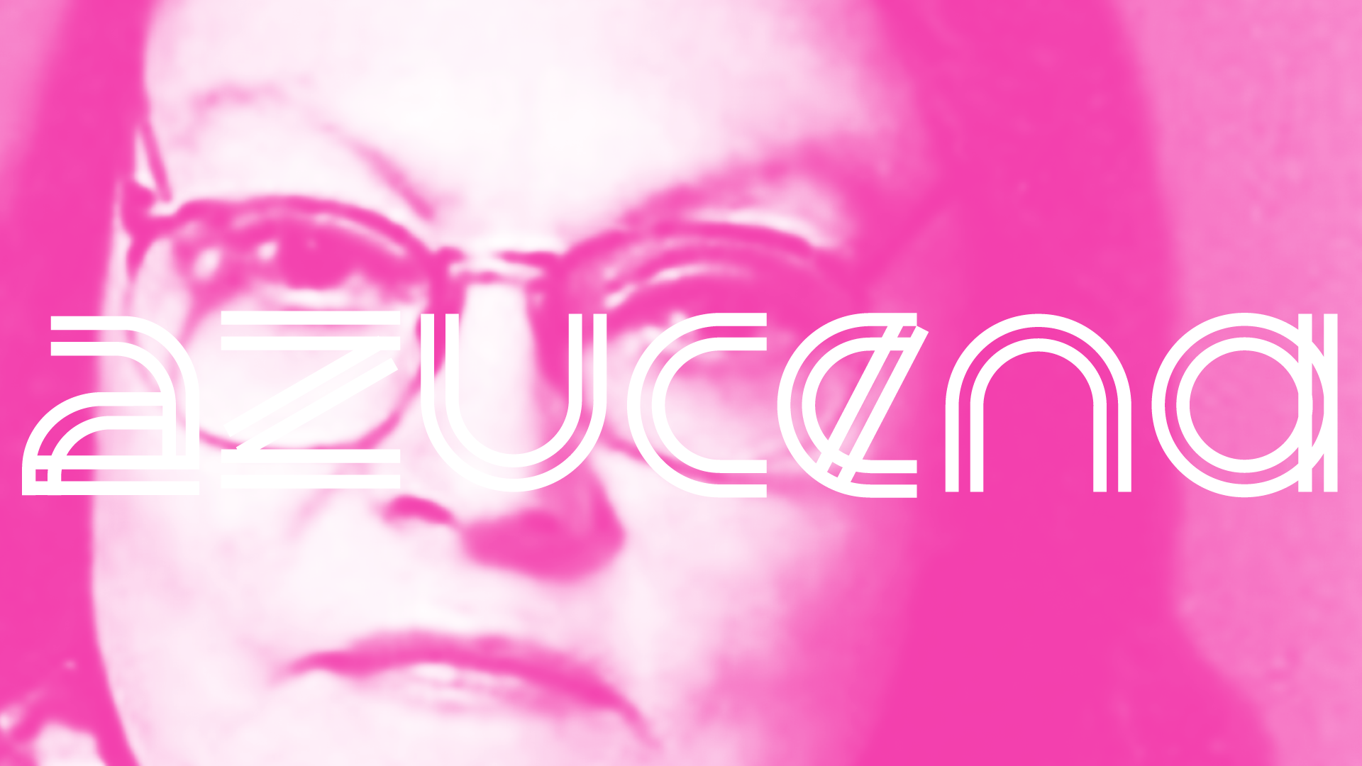

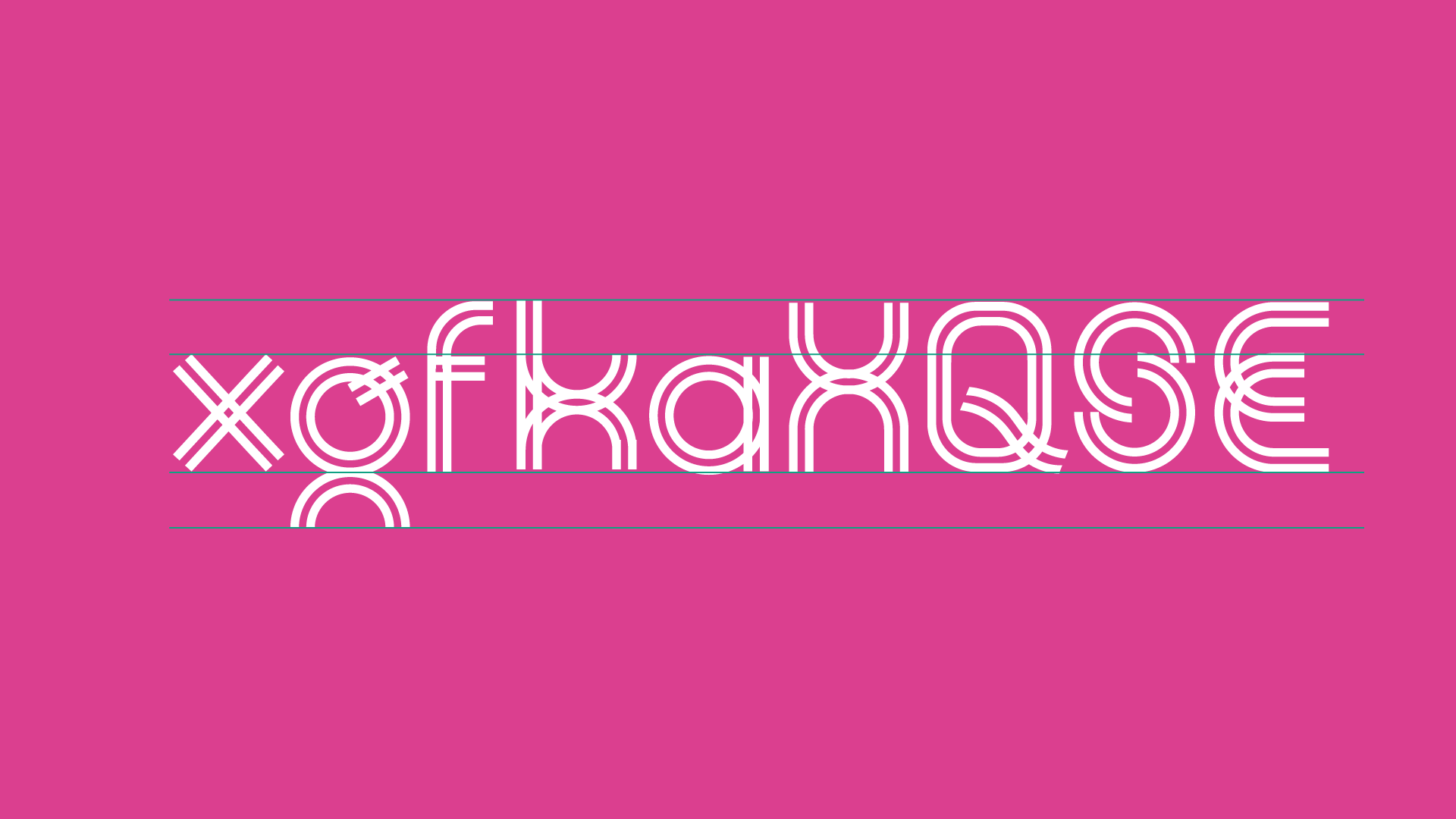
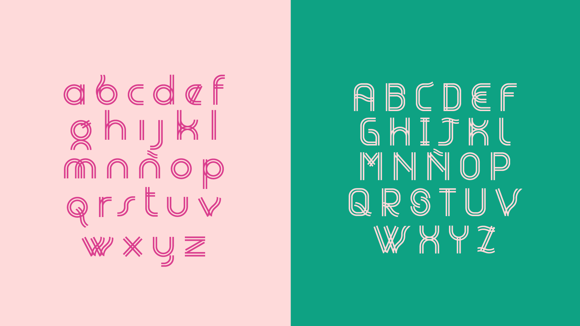
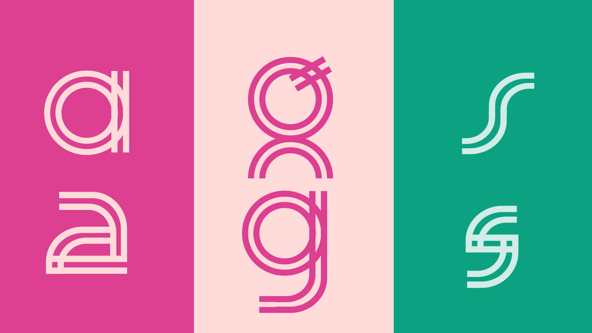
Los módulos base para el desarrollo de las letras, construidos en doble línea, representan dos dimensiones: la mujer física que mostraba frente a los demás y la mujer espiritual que transitaba emociones de rechazo interior y exterior, autoconocimiento y fortaleza. Las rectas y las curvas reflejan la adaptación de su vida a un entorno agresivo, marcado por el miedo a la diferencia.
The base modules used to develop the letterforms, built with double lines, represent two dimensions: the physical woman she presented to others, and the spiritual woman who navigated emotions of internal and external rejection, self-awareness, and strength. Straight lines and curves reflect her adaptation to an aggressive environment shaped by fear of difference.